Episode Transcript
[00:00:00] What's in a Cover?
[00:00:01] The Art and Localization of Video Game Covers by Marina Ilari they say you shouldn't judge a book by its cover, and when it comes to video games, the same could apply.
[00:00:12] The COVID art might not truly reflect the gameplay, but it can influence the game's success in different markets.
[00:00:20] This visual element is an introduction to the universe of the game's world.
[00:00:24] When localizing a game, the adaptation of the COVID art can be the difference between growth or realizing it's game over.
[00:00:31] Many games go through an adaptation or recreation of the COVID art to better suit the target market where the game will be commercialized.
[00:00:39] We have seen different covers for Asian countries versus the Western Hemisphere and even covers that differ between the European market and the North American market.
[00:00:48] In this article, I will analyze the covers of two video games that opted to adapt the COVID art for their different target audiences.
[00:00:56] Proper localization with attention to authenticity and accuracy is how an organization can truly level up its video game covers.
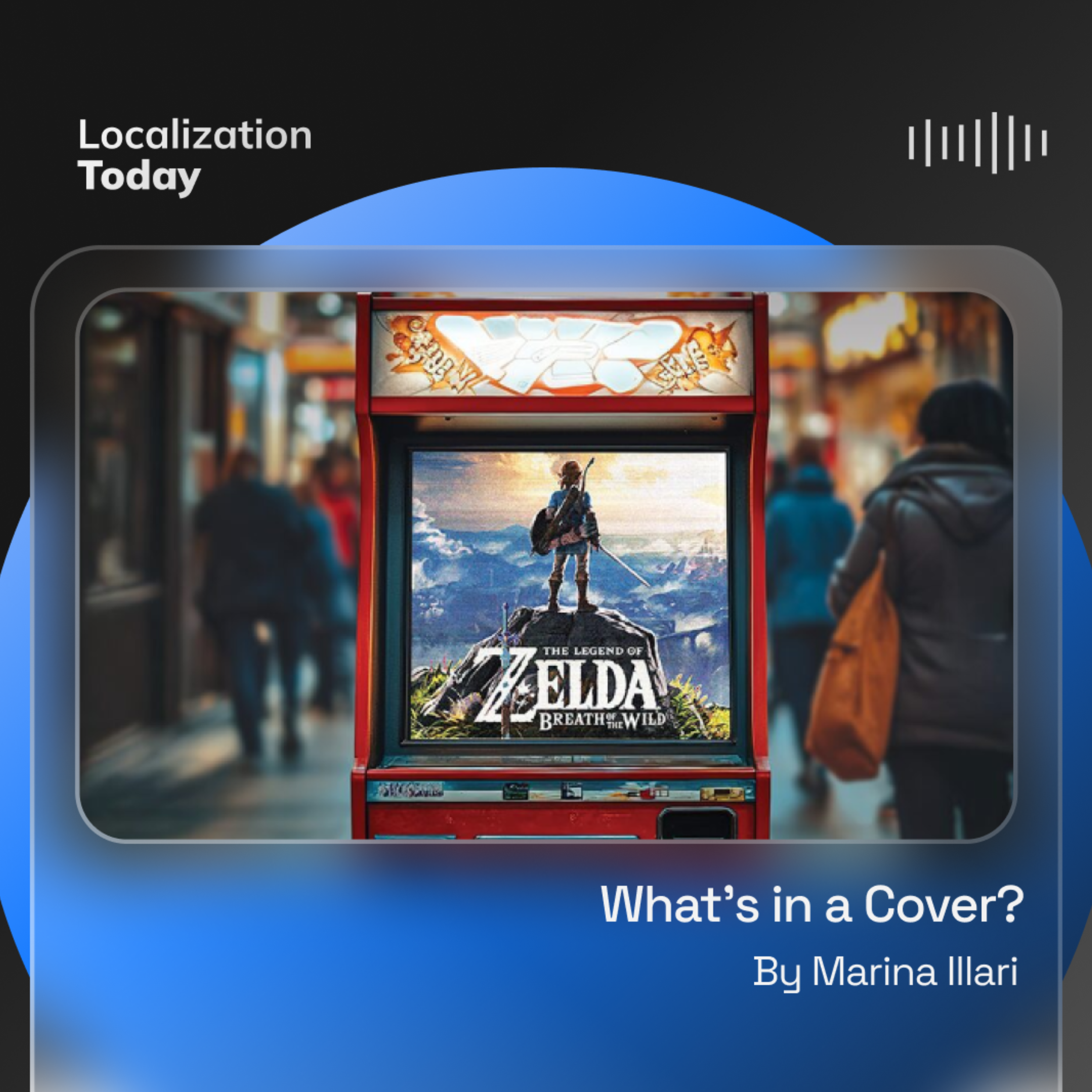
[00:01:05] The Legend of Breath of the Wild in the new edition of the Saga Classic Zelda, we can see a clear contrast between the European and North American cover. See Figure 1.
[00:01:16] This adaptation is notable because it occurs in a game released in 2017, which goes against the trend toward greater uniformity that has been seen in recent years.
[00:01:26] In the edition for North America, the hero is the central element in the scene.
[00:01:31] The character facing the horizon is prominent, exuding an image of power brandishing the sword in a pose that, though relaxed, is imposed on a natural setting including chiaroscuro and fire.
[00:01:42] It's difficult to find these archetypes, images of warriors from behind with a weapon in hand in European art.
[00:01:50] Generally in European art there is an effort to introduce certain subtlety and complexity to the personality of heroic characters.
[00:01:58] The North American cover showing the weapon wielding character from behind gives a fairly flat and one dimensional message, potential conflict, violence, and a powerful hero who must use his sword to overcome the conflict that awaits him.
[00:02:12] This message is in stark contrast to that of the European cover, in which the hero rests on his weapon posing in a contemplative attitude, which we find, for example, in Donatello's David, the young innocent hero who must face the world casually resting on his weapon.
[00:02:29] It's impossible to ignore the similarities between the epic tale of the young hero who saves the world and Link's character, an innocent and somewhat naive posture which contrasts with his true power and the importance of his mission.
[00:02:42] Other elements on the European cover highlight the central role of nature and the impressionist style that dominates Especially in the green of the grass, with much lighter colors, minimizing the volcano and the fire in the distance.
[00:02:56] The contemplative, confident, but fresh and innocent gaze of the protagonist contrasts with a somewhat stiff and unmistakable heroic pose on the North American cover.
[00:03:06] On the European cover, the sword is just a tool, whereas on the North American cover, it is a brandished weapon. The birds on the North American cover serve to reinforce the intense yellow of the volcano through contrast.
[00:03:19] On the European cover, the birds are out of focus. In fact, they can hardly be distinguished as such and provide a framework for the composition, evoking the idea of a proscenium that frames the story, a technique in European painting since the Renaissance.
[00:03:34] The leaves in the European edition also reinforce the depth and dimension of the composition at different levels from the closest to farthest, which include the grass, the character, the mountain, and the volcano.
[00:03:46] In contrast, the North American cover's composition is flatter and only two levels stand out, the character and the volcano in the background.
[00:03:55] In summary, in the effort to localize the covers, the developers of Zelda understood that the North American audience will be more attracted by the notions of conflict, heroism and violence of the game, while the European players will be attracted by the adventurous aspect of the game.
[00:04:11] Carmageddon. This is a well known game with an awful premise, a car race in which the player gains time by running over pedestrians that generated problems for its localization and globalization. Teams, in terms of localization central graphic aspects had to be modified to get approved both legally and culturally, and in terms of globalization. The game faced serious legal obstacles in Germany and the United Kingdom, and in some countries, like Brazil, was completely banned.
[00:04:40] To be able to commercialize the game in Germany and the United Kingdom, the developers had to remove the blood and the gore elements from the video game, as well as turn the pedestrians into zombies or robots to make the idea of running them over more acceptable.
[00:04:54] The covers speak for themselves of the huge cultural differences among audiences or the differences that the marketing departments for the respective regions assume to be the taste of these audiences.
[00:05:05] In the case of the North American edition, figure 2, the COVID is almost cartoonish.
[00:05:10] It seems to be funny to run over a pedestrian, and the content of the game is communicated unambiguously.
[00:05:17] In fact, there aren't even reservations about showing blood, anticipating something that will be seen throughout the game.
[00:05:23] In the case of the German cover, Figure 3, the design is much simpler than for the rest of Europe, focusing on the driver without additional elements.
[00:05:32] The driver's face and expression evoke features that we can see in German expressionist characters.
[00:05:38] His gaze and his sordid smile suggest that we are in front of a psychopath, a sinister and macabre character.
[00:05:45] This contrasts with the COVID for audiences in France, Italy, Spain, and other European countries. Figure 4 in which a grotesque face was chosen instead of a bleak expressionist character.
[00:05:56] His exaggerated features refer more to the grotesque theater of Latin cultures than the grim face of the character on the German cover.
[00:06:04] The element of racing is emphasized by the presence of cars at the base of the composition and the fact that it occurs in a city illustrated by the background of buildings on the horizon.
[00:06:15] We can see how the developers abandoned the cartoonish tone of the North American cover, since almost certainly the majority of the European audience, or at least the parents who had to buy the game at a time when the average player age was young, wouldn't find it attractive or funny to run over a person and splash his or her blood.
[00:06:32] Many efforts were made to contextualize the character while accounting for cultural differences that could be used as references that made sense for each consumer a delusional and grotesque character in the case of countries such as Italy, Spain, and France, and a shadowy character with expressionist features in the case of Germany. The adaptation and localization of the game covers are significant.
[00:06:55] By knowing the target audience well, cover designers can adapt to meet their local players needs and make this visual aspect unique and attractive for them.
[00:07:04] Like an esports tournament, Quality Localization is a multiplayer game that requires collaboration and teamwork.
[00:07:11] This article was written by Marina Ilari, an ATA certified translator and CEO of Terra.
[00:07:17] She has two decades of expertise in the translation industry with a focus on video game localization.
[00:07:24] She also serves as an adjunct professor at New York University, where she teaches. Audiovisual Translation Originally published in Multilingual Magazine, Issue 240, 6-20-25.